BATTERY
Powering ambition, one bite at a time
brand idea | naming | messaging | visual identity | logo | visual territory | communication materials
Battery is a fast-casual concept built around a simple insight: the people who move fastest are often the worst at fueling themselves properly. It set out to change that — not just with ready-to-go sandwiches, smoothies, and organic coffee, but with a brand that delivers encouragement and good energy alongside every order.
Brand idea
Battery stands for everyday energy — staying charged, moving fast, eating smart.
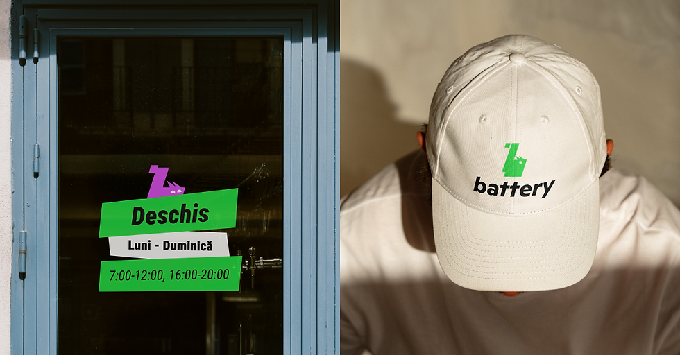
Visual identity
The brand needed an identity as energetic and dynamic as its audience.
→ Logo: Inspired by the squirrel — a symbol of agility, movement, and resourcefulness — executed in a stencil style for high recognition, easy application, and a modern, urban edge.
→ Visual territory: The stencil style extends across packaging, signage, and communication, creating consistency and a sense of play.
The result is a brand that speaks directly to active, ambitious people, delivering both fuel and motivation, and looking the part while doing it.