IWASH & EUROCLEANER
Rebranding for clarity
brand strategy | brand architecture | messaging | visual identity | logo | visual territory | communication materials
Iwash and Eurocleaner belong to the same group of companies, both active in the automated vehicle wash market. But overlapping services aimed at the same B2B customers had created confusion — internally and in the market. The challenge: define each brand's distinct role and their relationship to one another, so that together they could serve the market better, and individually reach their full growth potential.
Brand strategy
We started by defining the brand architecture and assigning clear roles:
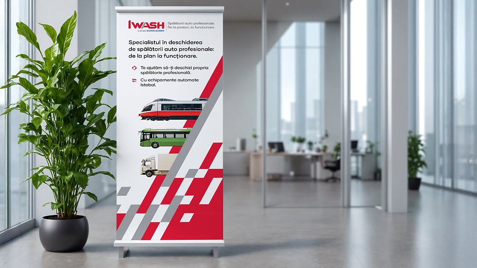
→ Iwash became the lead brand, integrating products, consulting, and services for opening automated car washes.
→ Eurocleaner was repositioned as the dedicated maintenance provider for Iwash's clients, the partner that keeps what Iwash builds running smoothly.
Visual identity
→ Visual territory: The identity needed to signal that the two brands are part of one system. A shared visual territory built on dynamic, sweeping lines — drawn from the movement of automated wash brushes and the speed that comes with automation — creates unity across the portfolio, while color does the work of differentiation.
→ Color: Red for Iwash — bold, energetic, leading. Blue for Eurocleaner — reliable, technical, service-driven.
→ Logo: Both brands received a logo facelift, creating a fresh, unified look across the portfolio.
The clarified brand architecture positions Iwash and Eurocleaner as stronger together: one opening the way for automated wash businesses, the other ensuring they run smoothly.